


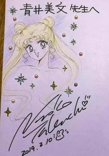
So, I thought it was about time someone started a thread where all of Naoko's recent artwork (i.e. since 2012, the start of the 20th anniversary celebration) could be compiled and discussed. How has her art evolved, how has it devolved, how has it stayed the same, etc.
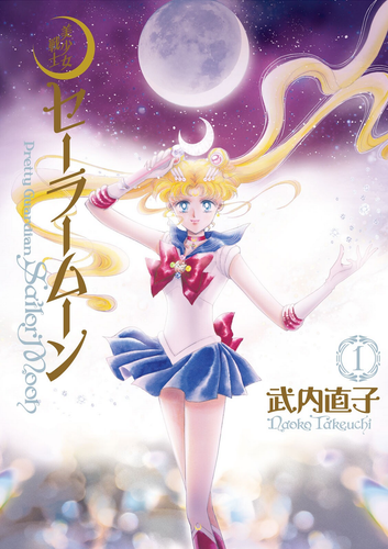
Released as the first phase of the franchise's 20th anniversary project, the perfect edition of the manga was aimed at original fans of the series, now adults (mostly women) in their mid- to late-twenties and thirties. Hoping to appeal to that demographic, Naoko created cover art that gave the manga the feel of something sophisticated and luxe, and firmly established Sailor Moon's "Now Look" aesthetic, which I've dubbed "Solemn in Sequins" (or, if you prefer, "Bittersweet and Bedazzled"). The Sailor Guardians have a more mature look about them, each illustration tinged with a mix of mystique and melancholy (setting the covers in stark contrast with the cuter, more brightly colored shinsouban covers, obviously aimed at young readers). Their chokers are now bedazzled metallic strips, their tiaras, earrings, chest bow ornaments, and other details likewise done with paste-on jewels and metallic cut-outs. Though the character artwork otherwise looks to have been hand drawn in pencils, the backgrounds and effects are obviously digital creations.
Now that we've established the basics of Naoko's recent style, let's see how her new artwork compares to her old.
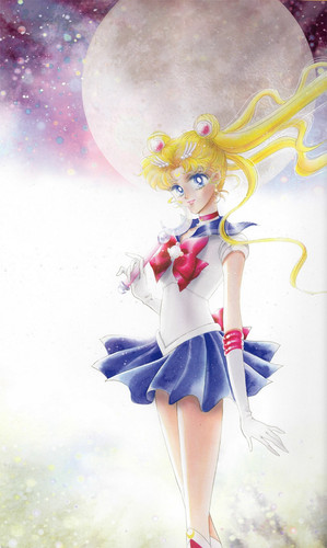
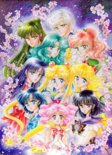
Let's start with the cover for volume one and its companion image, used in the La Reconquista pamphlet and for the 20th Anniversary Memorial Tribute Album:
With respect to the poses and general composition, these images feel reminiscent (at least to me) of the unused cover art for the first volume of the tankobon, and the cover art for the Infinity art book:
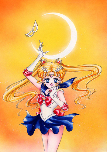
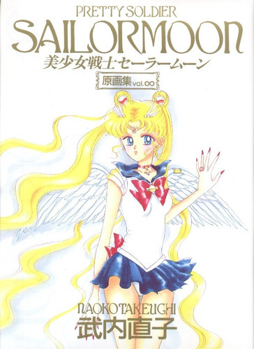
To me, the newer pieces shows definite growth on Naoko's part as an artist: the anatomy is better, and the art has more detail. The older art is definitely lovely and charming, but I think the newer work outshines it.
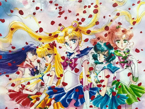
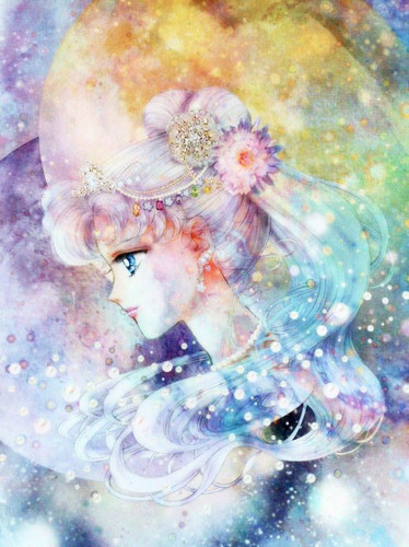
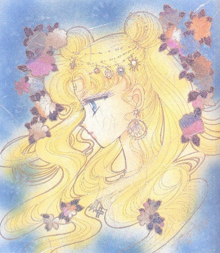
Now let's compare the cover for volume 9 with one of the illustrations from the first art book:
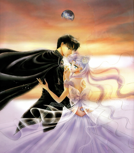
Here I feel that, though the newer work is beautiful and more polished, the older piece is more effective at conveying the tragedy and depth of Serenity and Endymion's romance. Its simplicity and roughness imbues it with a certain quality that feels lacking in the newer illustration.
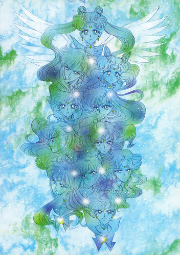
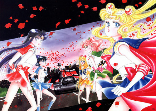
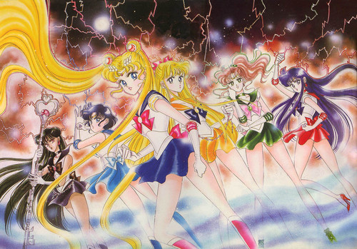
Lastly, let's look at the cover for volume 10, which feels generally reminiscent of a handful of older pieces with respect to concept/composition, so I'll use the first page of Stars 1 as an example:
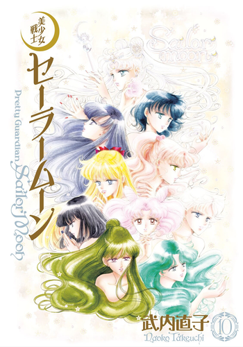
I think the cover art is beautiful, but there are obvious issues: the weird hand, the weird decision to write "Sailor moon" in the corner, Rei's profile, and something looks off about Chibiusa's face. The stuck-on jewels are also a little tacky-looking here, which takes away from what otherwise would have been a very elegant piece (the pasted on metallic nails are particularly unfortunate). The illustration from Stars is more coherent, has no tacky embellishments, has a bold stylization choice, features a variety of facial expressions, etc. It's a stronger piece in my opinion.
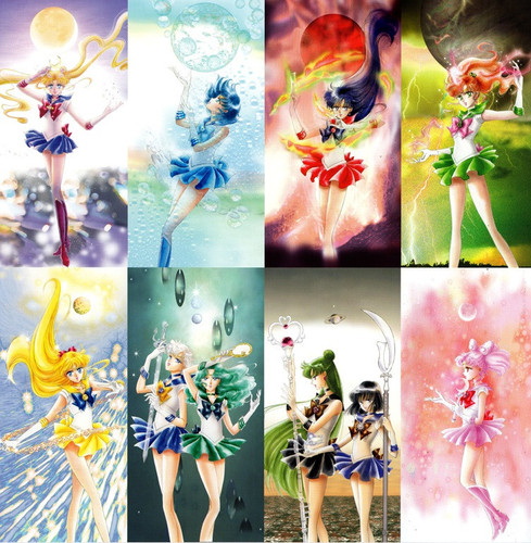
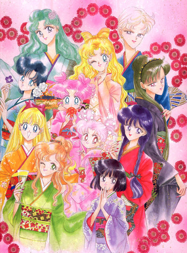
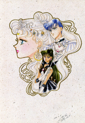
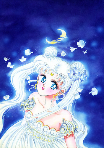
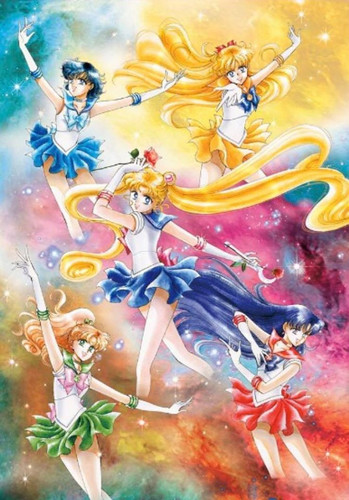
And since I don't want to go on boring you with my analyses of each recent bit of Naoko's artwork, I'll simply add them below alongside older pieces they remind me of so you can do your own comparisons:
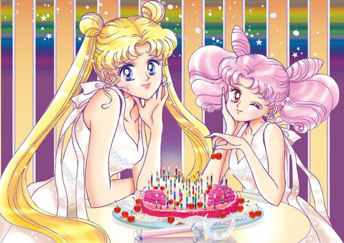
(I really love the bolder color use in the new image, along with how Chibiusa's hair looks. It's nice to see an illustration from this era that isn't so muted. But I also love all the different hairstyles the girls are rocking in the older piece.)
Released as the first phase of the franchise's 20th anniversary project, the perfect edition of the manga was aimed at original fans of the series, now adults (mostly women) in their mid- to late-twenties and thirties. Hoping to appeal to that demographic, Naoko created cover art that gave the manga the feel of something sophisticated and luxe, and firmly established Sailor Moon's "Now Look" aesthetic, which I've dubbed "Solemn in Sequins" (or, if you prefer, "Bittersweet and Bedazzled"). The Sailor Guardians have a more mature look about them, each illustration tinged with a mix of mystique and melancholy (setting the covers in stark contrast with the cuter, more brightly colored shinsouban covers, obviously aimed at young readers). Their chokers are now bedazzled metallic strips, their tiaras, earrings, chest bow ornaments, and other details likewise done with paste-on jewels and metallic cut-outs. Though the character artwork otherwise looks to have been hand drawn in pencils, the backgrounds and effects are obviously digital creations.
Now that we've established the basics of Naoko's recent style, let's see how her new artwork compares to her old.
Let's start with the cover for volume one and its companion image, used in the La Reconquista pamphlet and for the 20th Anniversary Memorial Tribute Album:
With respect to the poses and general composition, these images feel reminiscent (at least to me) of the unused cover art for the first volume of the tankobon, and the cover art for the Infinity art book:
To me, the newer pieces shows definite growth on Naoko's part as an artist: the anatomy is better, and the art has more detail. The older art is definitely lovely and charming, but I think the newer work outshines it.
Now let's compare the cover for volume 9 with one of the illustrations from the first art book:
Here I feel that, though the newer work is beautiful and more polished, the older piece is more effective at conveying the tragedy and depth of Serenity and Endymion's romance. Its simplicity and roughness imbues it with a certain quality that feels lacking in the newer illustration.
Lastly, let's look at the cover for volume 10, which feels generally reminiscent of a handful of older pieces with respect to concept/composition, so I'll use the first page of Stars 1 as an example:
I think the cover art is beautiful, but there are obvious issues: the weird hand, the weird decision to write "Sailor moon" in the corner, Rei's profile, and something looks off about Chibiusa's face. The stuck-on jewels are also a little tacky-looking here, which takes away from what otherwise would have been a very elegant piece (the pasted on metallic nails are particularly unfortunate). The illustration from Stars is more coherent, has no tacky embellishments, has a bold stylization choice, features a variety of facial expressions, etc. It's a stronger piece in my opinion.
And since I don't want to go on boring you with my analyses of each recent bit of Naoko's artwork, I'll simply add them below alongside older pieces they remind me of so you can do your own comparisons:
(I really love the bolder color use in the new image, along with how Chibiusa's hair looks. It's nice to see an illustration from this era that isn't so muted. But I also love all the different hairstyles the girls are rocking in the older piece.)


")

